'Does that look off to you?': Welcome change at St James' Park has a lot of fans saying the same thing
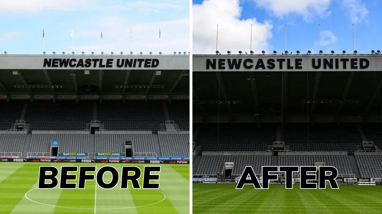
As we reported last week Newcastle United have made the welcome change to the lettering above the East Stand removing the italic club name and replacing it with the old style lettering.
The italic font that adorned the East Stand was a relic of the dark times as it was the "Sports Direct" font with several fans, led by local journo Dominic Scurr, asking the club to change it.
When a mobile scaffold was spotted in the ground last week we assumed that's what was happening and now we've had confirmation that that was exactly what was happening.
A new image surfaced on X today thanks to the club's official account, showing the lettering back to its normal block lettering that used to be there before Mike Ashley had it changed.
Many people have spotted something that looks off
While fans were delighted to see the last remaining mark from the Mike Ashley days gone, many people have a similar issue with the change.
People on X, the lads in our office, and people with whom I'm in a WhatsApp group with have all noticed the same thing.
Something is just not right with the letter C. Nobody can quite put their finger on it, but there is absolutely something not right there.
It's still an improvement
The overall opinion is that it's not quite the same size as the other letters.
When you have that in your mind then, the more you look at it, the smaller it gets.
Still, we'd rather have one letter ever so slightly off than have the whole name in that rotten Sports Direct font, so it's still a massive win as far as we're concerned.