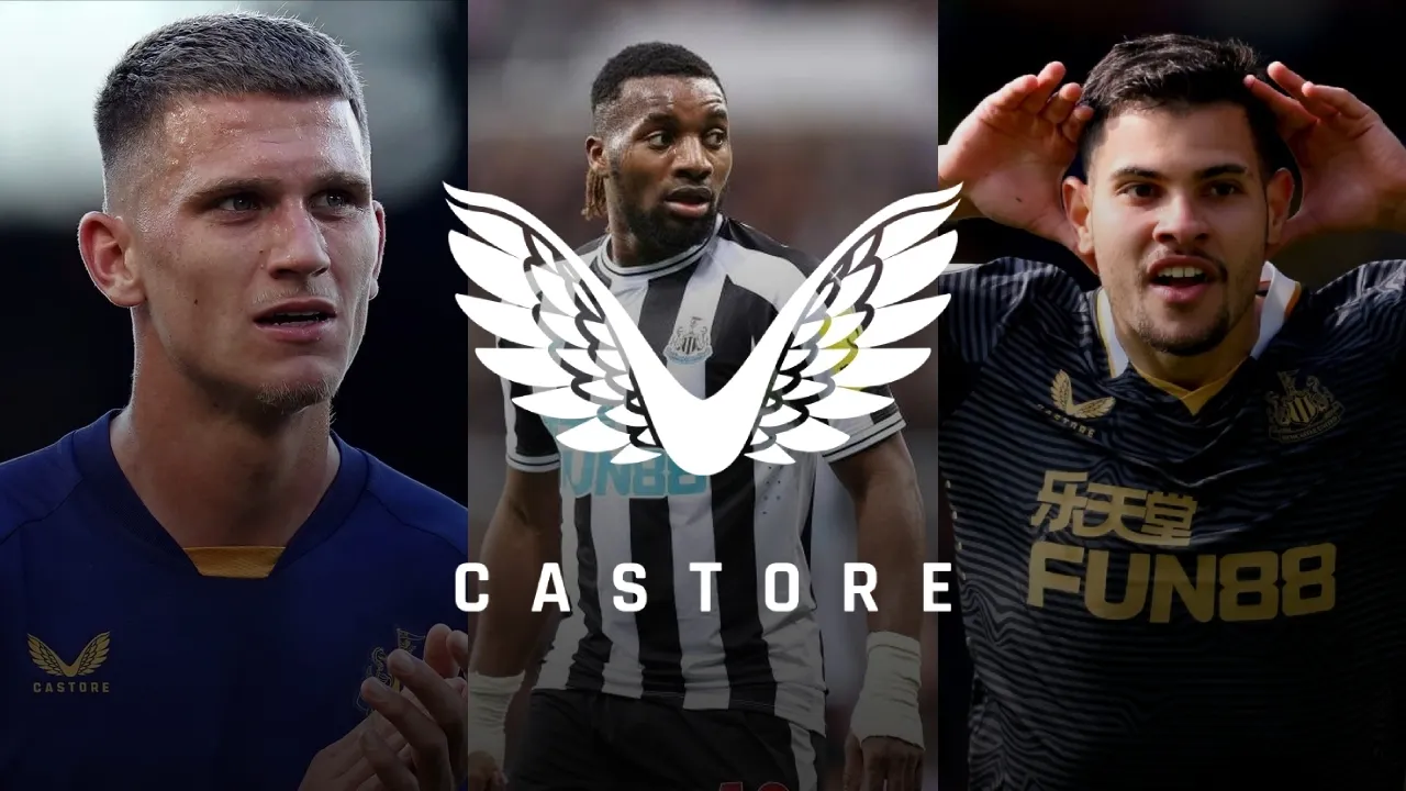
Every NUFC Castore Kit Ranked
The past three seasons at Newcastle United have made a refreshing change from the decade and a half of drudgery that came before them. Of course, that is all down to the 2021 takeover and the incredible turnaround it has provided both on and off the pitch.
One lasting hangover from the Mike Ashley era was, however, the questionable deal to give up-and-coming sportswear brand ‘Castore’ a five-year, £5-million-a-season contract as the club’s kit designer. It was a decision where criticism was felt on all fronts; from slow delivery times, to questionable quality control resulting in dwindling sales and poor match durability.
But Newcastle weren’t the only club to suffer from Castore’s negligence. Aston Villa’s men and women teams suffered from a strange skin-sticking sweat phenomenon that made their Castore kits look drenched and clingy; while a photo went viral of a Wolves kit where the famous hexagonal club logo was stitched on upside down. And just recently, Everton became Castore’s latest fashion victim; when they debuted their new kit in a preseason friendly, only for the club badge to fall off a player’s shirt. To add insult to injury, the RRP? £110. Maybe put it on a low-temperature/no-spin wash, Toffees fans?
Naturally, the post-takeover Newcastle board decided enough was enough; and there were more lucrative deals to be made elsewhere; namely, a big money reunion with sport titans Adidas; with a collaboration which has captured the imaginations (and wallets) of Toon fans worldwide.
So the Castore deal was cut short two seasons early, and while minimal tears were shed, we’ve decided to look back on the ten outfield match shirts that Newcastle United wore during that three-year stint that saw so much change at the club - and to commemorate the launch of Adidas’ third kit for the 24-25 season!
10th - Home 2021/22
I mean… this shirt alone was enough of a warning sign that our marriage with Castore wasn’t going to be a long and happy one. If the design wasn’t bad enough (and we’ll get to that), this shirt would also be synonymous with a third relegation in thirteen years were it not for a nation state pumping hundreds of millions into a second-half season turnaround.
Buttons on a modern football shirt always look ugly with a grandad collar; but to then put them on a white strip against the shirt’s central black stripe was absolutely ridiculous. It blessed us with the atrocious ‘number 4’ pattern that had Geordies scratching their heads and putting their wallets away. Just how did this get off the drawing board and onto the pitch?
Luckily, things got better for the club, both on the pitch and on the fashion front… maybe skip the next entry on this list though.
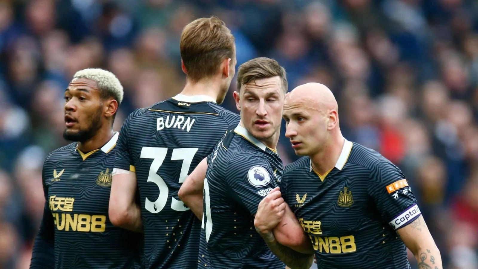
9th - Away 2023/24
As bad as 10th place was, this kit was only saved from bottom space by one member of the NUFCFEED team putting it second highest on his list. Green is a risky colour when it comes to football; not just for aesthetics but the (rather childish) worry that it will camouflage the players on the pitch; a bit like that grey Manchester United monstrosity that Fergie tried to blame a defeat on.
And while Newcastle’s players weren’t exactly camouflaged in this kit, they might as well have been. That way, we would have had an excuse for such terrible performances as Brighton and Bournemouth Away last year. Yeesh.
8th - Alternative 2022/23
A slightly fortuitous inclusion, but a necessary one. This design was only ever meant to be a pre-match training top; but due to a bizarre ruling of a colour clash v Brighton, Newcastle were forced to wear it in a one-off circumstance. The league decided that none of Newcastle’s three other kits were suitable against Brighton’s blue-and-white-strips, meaning this one got a run out, and was presumably forgotten about by most fans until now.
The scoreline that day? 0-0. And only a Nick Pope wonder save kept us in it. And, naturally, because he’s a goalkeeper, he didn’t even wear this shirt.
The Newcastle skyline was a lovely touch, but the queasy pale colour (and the fact it does undeniably look like a piece of training kit) means we couldn’t put it higher than 8th.
7th - Third 2021/22
This kit will be forever etched in my mind because of a Joelinton bullet header away at Brentford; a goal that firmly announced him to the Premier League as the midfield colossus that he is today. This one didn’t get too many run-outs in the league, but it was a damn sure improvement on its number 4-clad home counterpart.
6th - Third 2022/23
The “Saudi kit”. Yep, this is probably the shirt that rival fans will remember the most; desperate for any sort of jibe about the ownership after ‘Richest Club in the Championship’ jeers were snuffed out pretty quickly.
It was actually a pretty smart design; minimalistic and clean - but I can’t recall too many great away days in it; save for the Allan Saint-Maximin volley of the season moment; and of course… the 4-1 demolition of the bitter Toffees at Goodison Park.
Hmmm, on second thoughts… maybe 6th is too harsh now?
5th - Third 2023/24
An electrifying colour combo made this a hit with some of our team and a miss with others. It also reminds me a little bit too much of two kits from the previous season; one of Newcastle’s which is still to come; and a Manchester United away kit (not really a club the Geordies want to be reminded of).
Still… we won eight-nil in this one, didn’t win many others in it though, mind.
4th - Home 2022/23
Now this is how you do the black and white stripes effectively. Simple, yes… but effective. After years of tiny thin ‘barcode’ stripes from Puma, it was nice to get a shirt that found a perfect balance between black and white, with a nice snug neck trimming and pale blue accents.
It was the first home kit I bought for over a decade; and it was also the kit we finished 4th in, so 4th in this list seems like poetic justice.
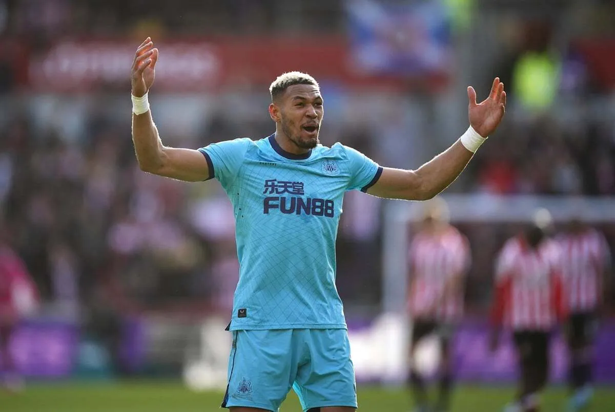
3rd - Away 2021/22
Another one that polarised opinion in the office; this kit took many Geordies by surprise. The black and grey sound-wave pattern was slightly reminiscent of Joy Division’s iconic ‘Unknown Pleasures’ album artwork; while the smart white and gold collar gave it a rugby-esque aesthetic. Nothing was going to look perfect with the ugly ‘FUN88’ logo splashed across the front; but for many of us, this design was a refreshing ‘out-of-the-box’ take on sportswear. Plus Callum Wilson modeled the heck out of it.
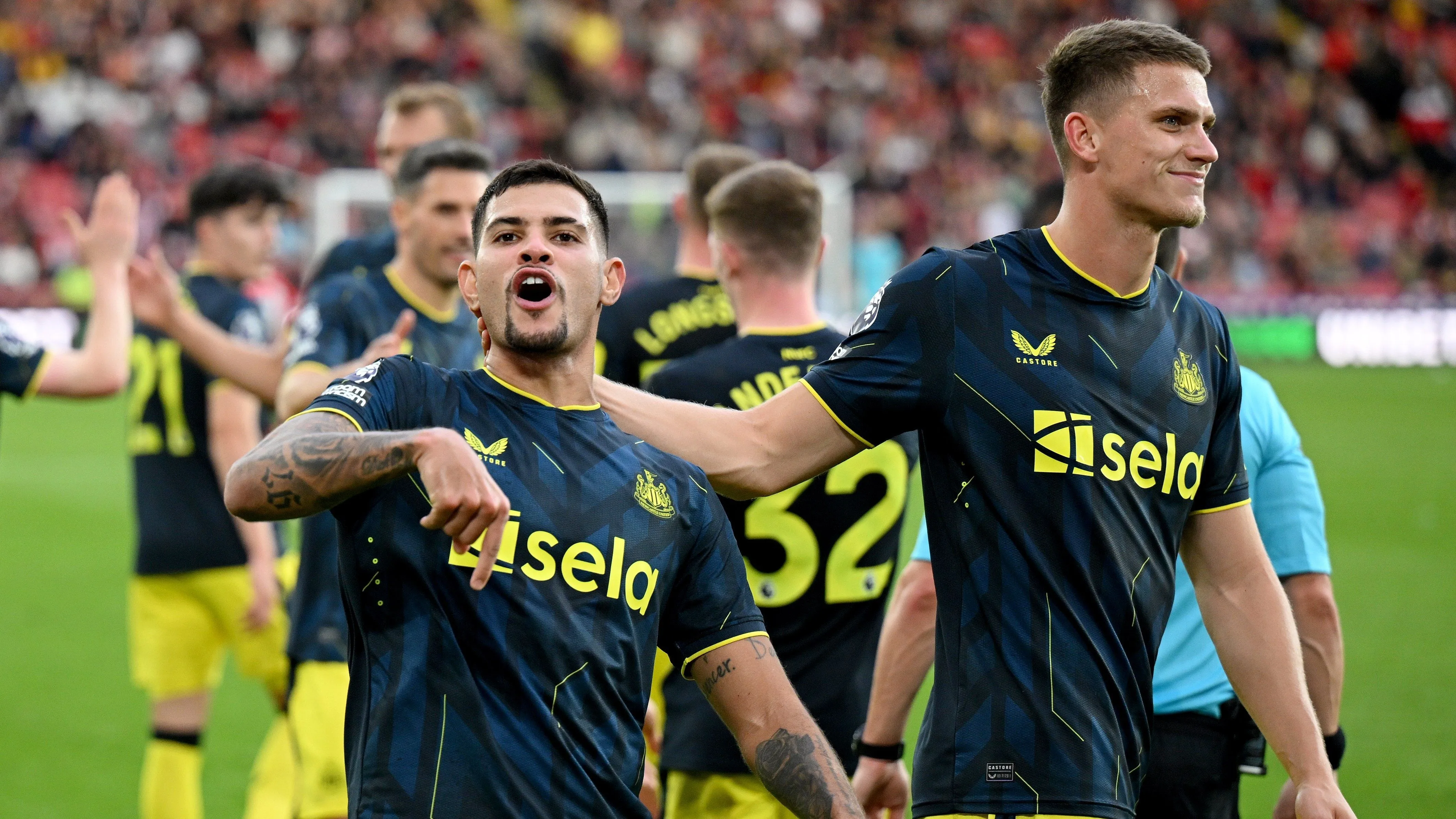
2nd - Away 2022/23
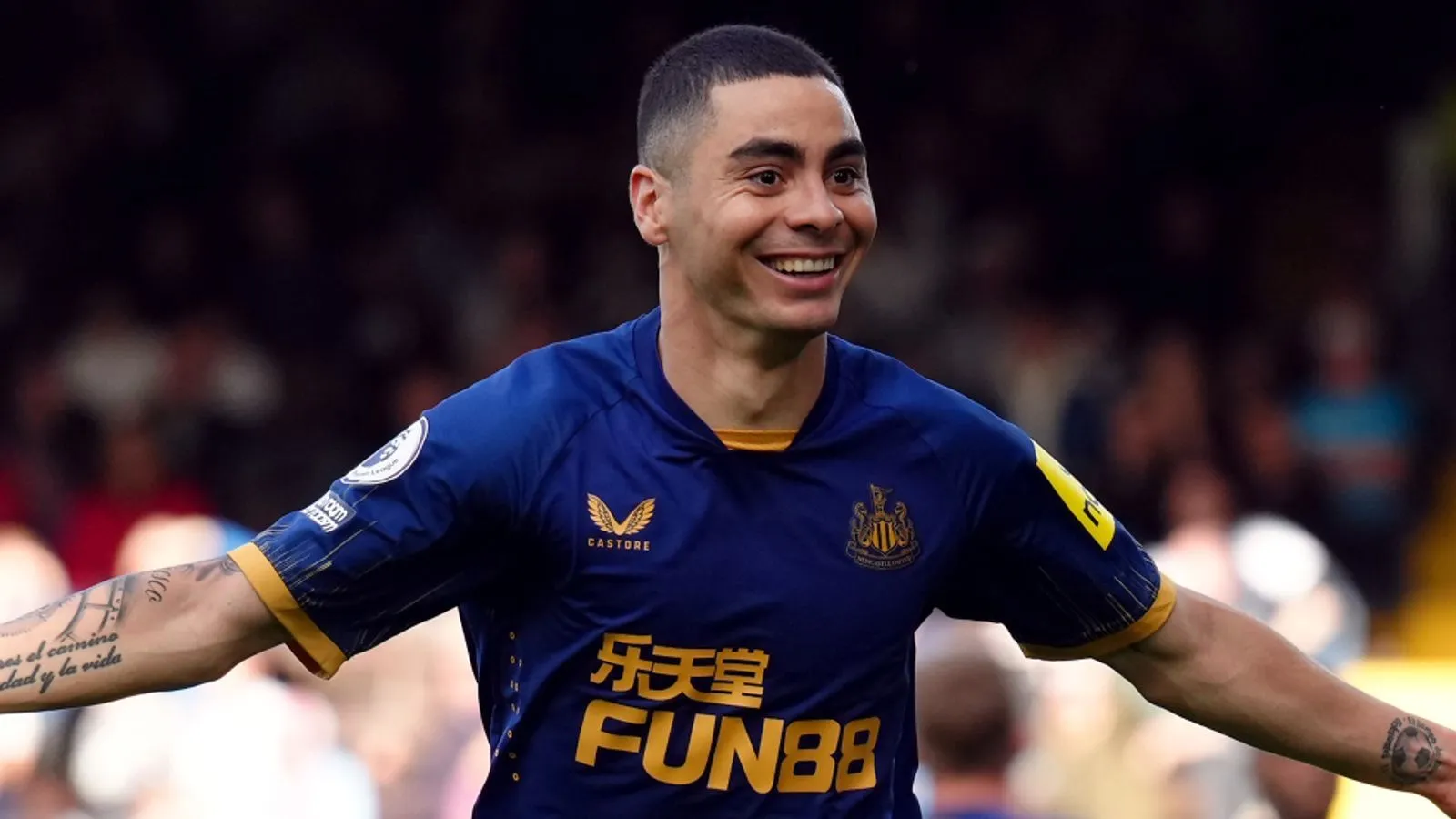
Were we biased putting this kit second? We seemed to win every time we wore it. Almiron’s outside foot volley at Craven Cottage… Isak’s thunderbolt at the Gtech… Wilson battering past Lloris to let fly at the Hotspur Stadium… this kit well and truly owned the capital; and we were living for it.
A smart colour combo of blue and gold also made this an upgrade on its Manchester United-esque successor, and watching our beloved Swede rip home defences apart time and again towards the tail-end of the season was a real highlight.
Well done, Castore.
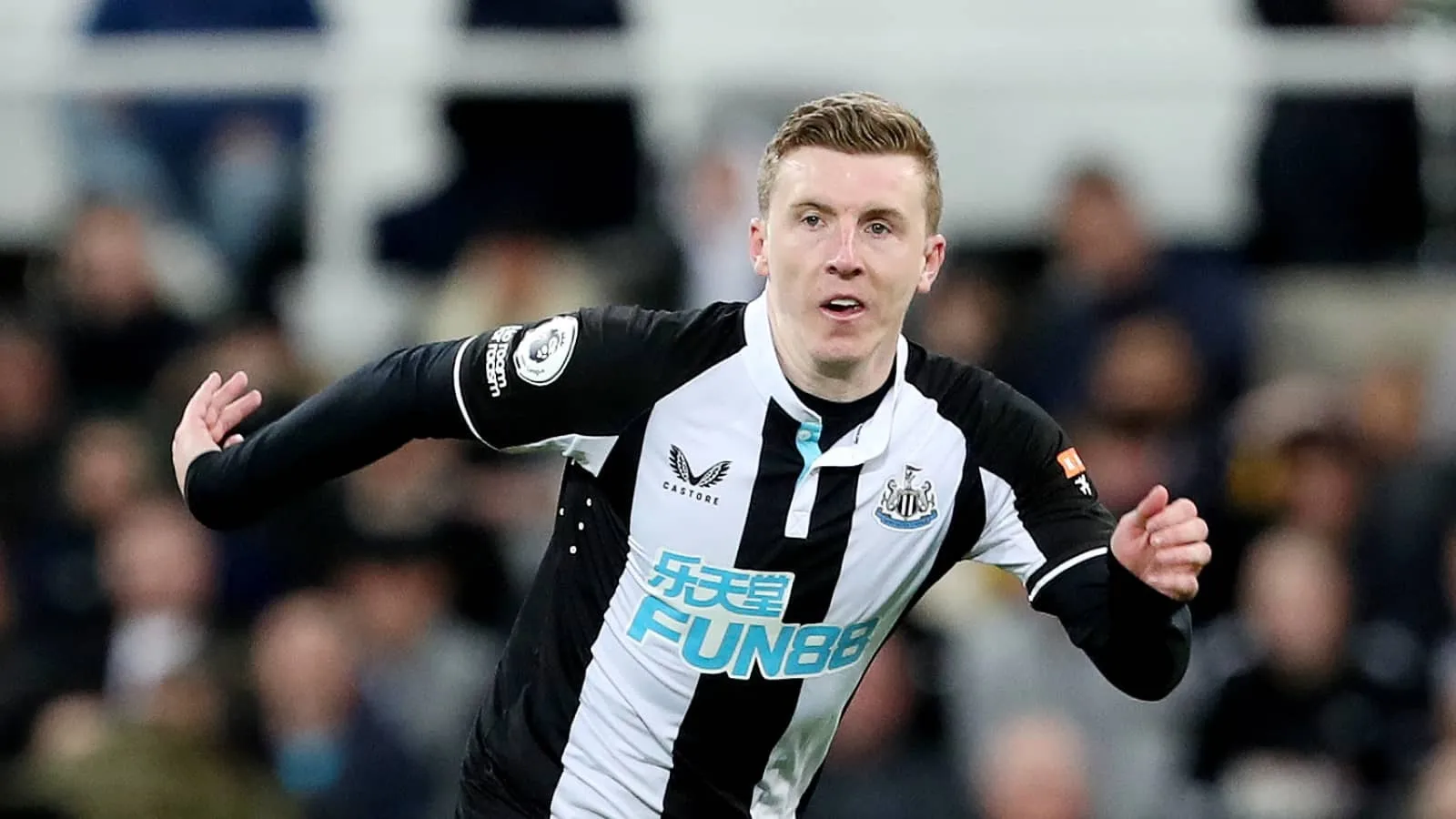
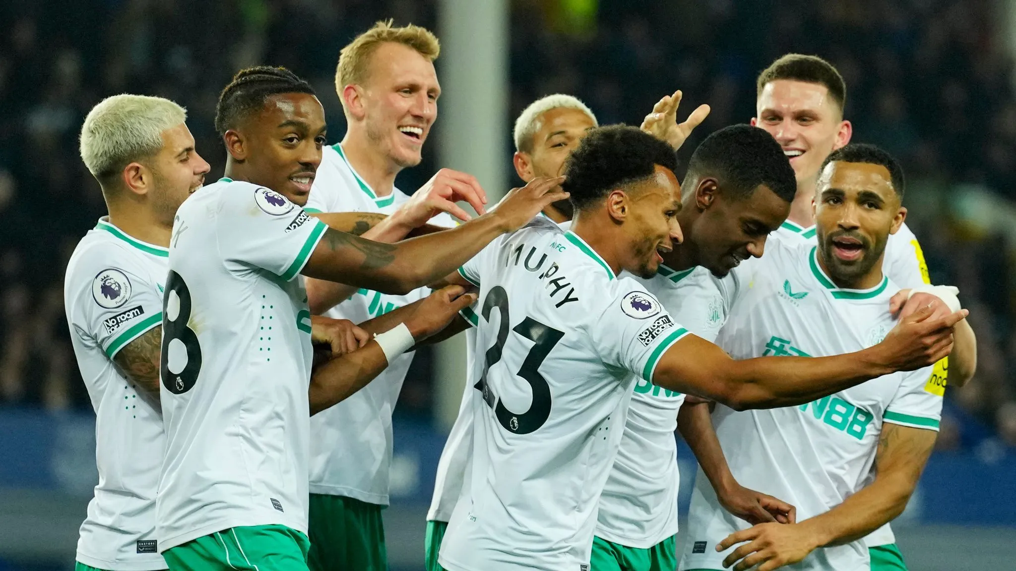
1st - Home 2023/24
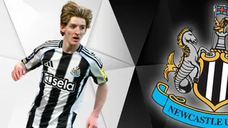
Our number-one spot builds on the steady foundations of its home kit predecessor in fourth place; but adds a little extra dash of pizzazz in the right areas. The V-neck collar is sharp; and the awful ‘FUN88’ logo has made way for the smart, colour-coordinated black and white font of ‘Sela’ instead. Shame about the obnoxious yellow ‘noon’ square leaping off the sleeve to steal your unwanted attention, but hey, it was a very decent closing chapter for Castore in their final season as kit designers. It also announced the arrival of Lewis Miley to the Geordie faithful; even if the kit’s defining Miley moment was when it got virtually ripped off the youngster’s chest by Erling Haaland.
That’s Castore quality for you.
So there we have it, let us know which Castore kit was your favourite - and which player/goal/moment comes to mind when you see this medley of fashion disasters and slick threads. Bring on Adidas!